The article has a black heading as it says 'Alex Turner? The dullest man in the world' so they might be being humerous in their article by making the font a dull colour. The main image is in the middle of the page to draw the attention of the reader. This is an interview and the interviewer's words are in red and the answers are in black. There is also a red box with information in it which is bigger than the interview text which gives a preview of what is being said in the interview. There is also a puff which advertises a competition and what the reader can win. The colours in the article are red, white and black which are the most common colours used, as they are the most appealing colours to the human eye. The person in the main image has been placed in a white background so that he stands out and it is eye-catching. I like the way the interviewer's text is in bold and the answers are in black, I also like the way the main image has been placed, straight in the middle with the text around it. I like the basic colours of the article and the way it hasn't got too much going on so that it is easier to concentrate on the article itself.
Friday, 4 November 2011
Analysis of Language and Layout.
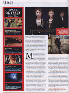
The article has a main image at the top of the article so the reader understands what the article is about. It shows the band against a black background and there is a little box of information on a red background which stands out from the black and the writing is in white. Underneath this picture is another picture of the lead singer standing alone because he is the main topic of discussion in the article. On the left-hand side of the article is another short article called 'Space Odyssey', the background is in red which keeps with the theme of the magazine. It is a production technique.
Subscribe to:
Post Comments (Atom)


No comments:
Post a Comment